Project Description
 Back to All Projects
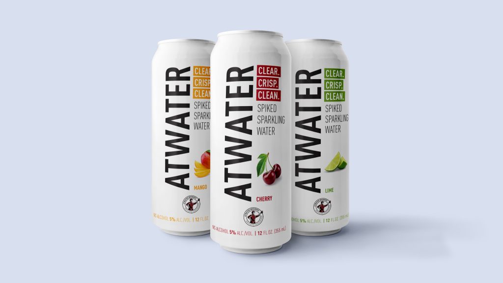
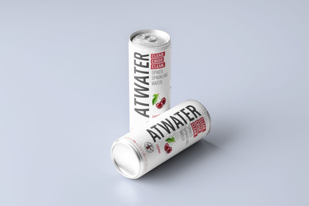
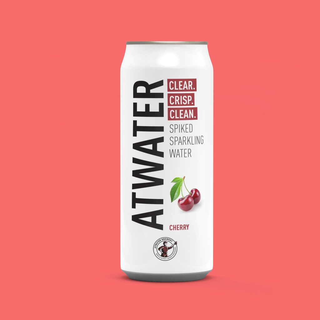
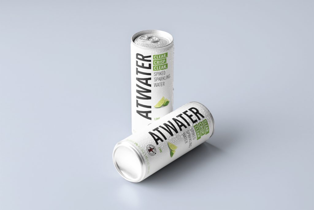
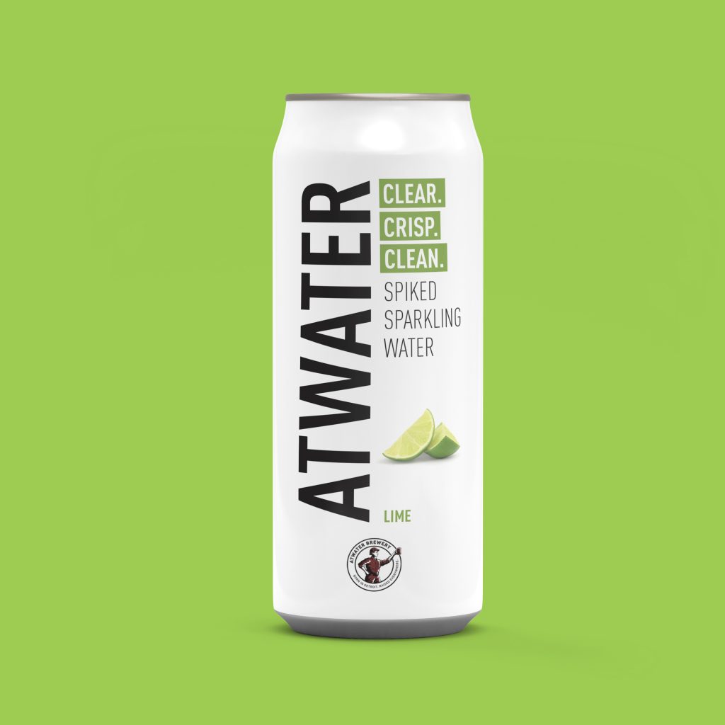

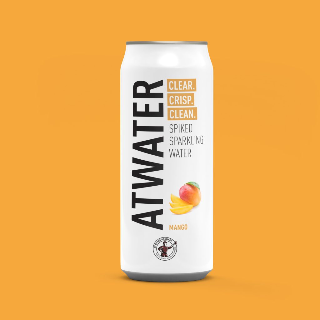
To develop a fresh brand identity for Atwater’s line of hard seltzers that visually separates the product from its beer-focused parent brand, while still maintaining a subtle connection to its heritage. The objective was to create packaging and branding that felt bold, modern, and distinctly seltzer. Appealing to a younger, trend-conscious market.
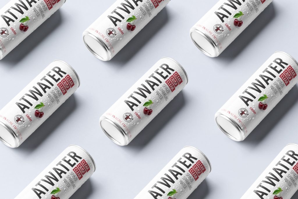
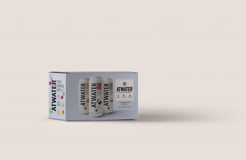
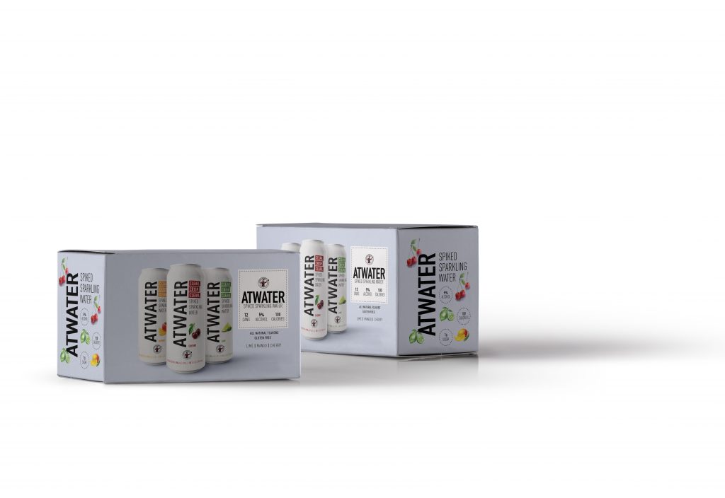
Inspired by the crisp, refreshing nature of seltzer itself, the design leans into bold color blocking, clean type, and playful iconography. Each flavor features a unique color palette and minimalist layout, allowing for quick shelf recognition and a vibrant presence in a saturated market. The visual language was intentionally stripped back to differentiate from Atwater’s craft beer branding. Signaling a lighter, more contemporary product while maintaining the brand’s spirit through subtle typography and layout cues. The result is a system that feels cohesive, energetic, and ready to stand out in both coolers and hands.