Project Description
 Back to All Projects


Happy Cry Cannabis is a unique cannabis brand focused on delivering a diverse range of high-quality products that evoke both joy and reflection. Our brand identity embraces a playful and colorful aesthetic, blending creativity with depth to stand out in the cannabis market. We aim to position Happy Cry Cannabis as an expressive and memorable choice for consumers seeking an emotional connection with their cannabis experience, combining lightheartedness with authenticity.
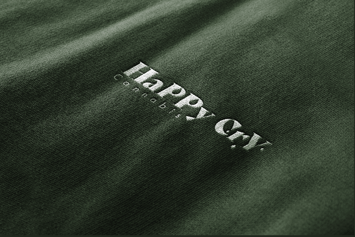
Logo:
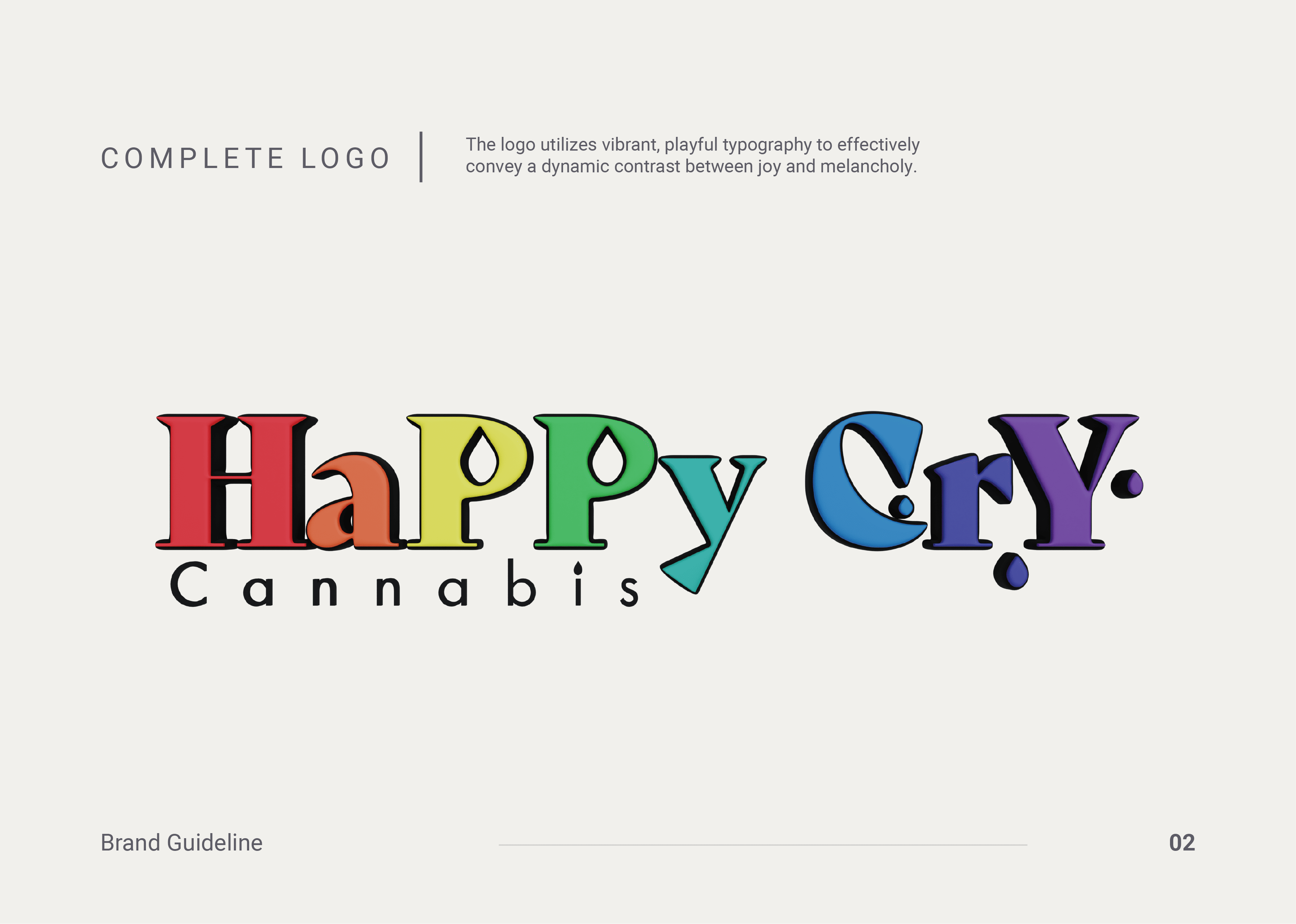
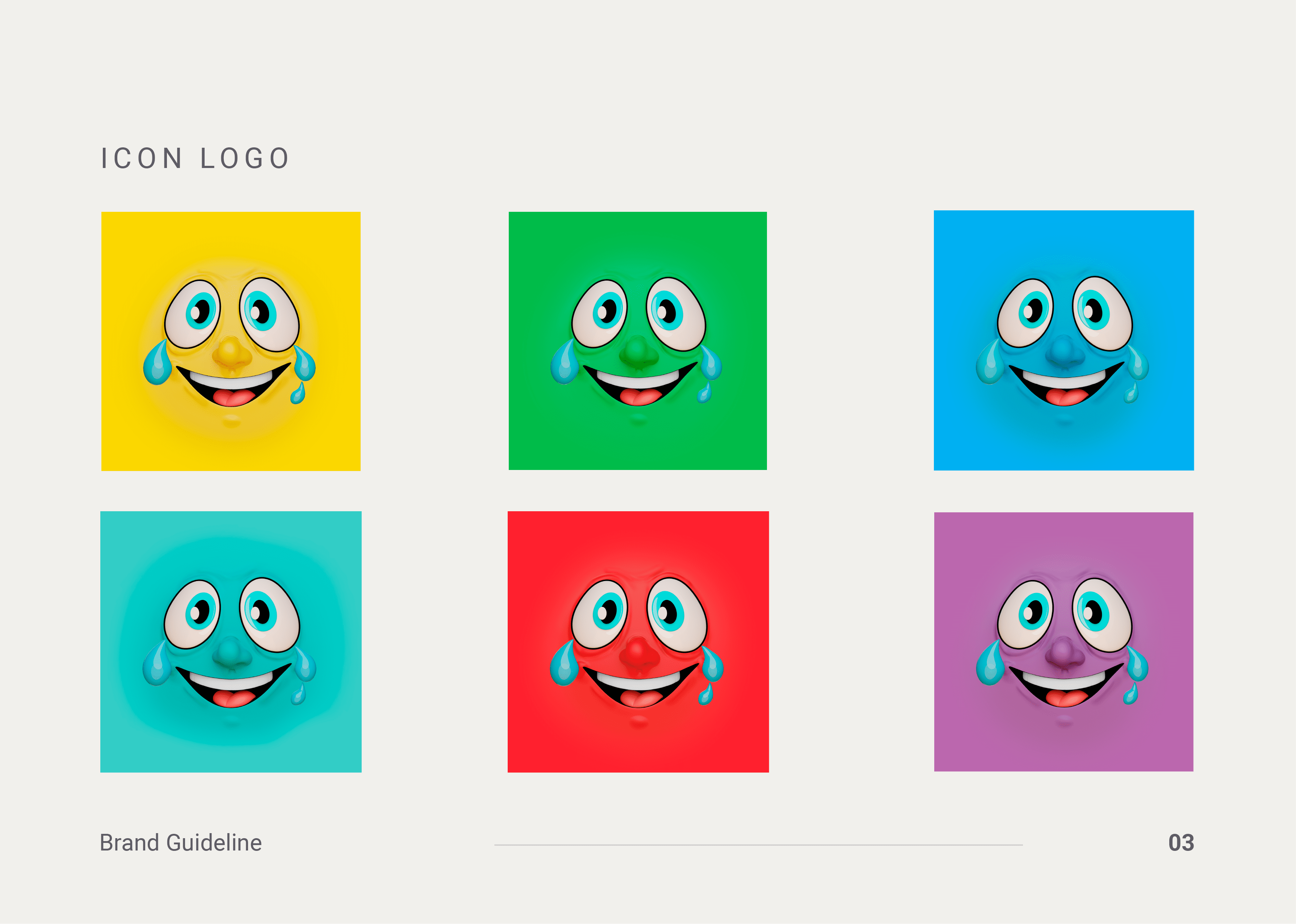
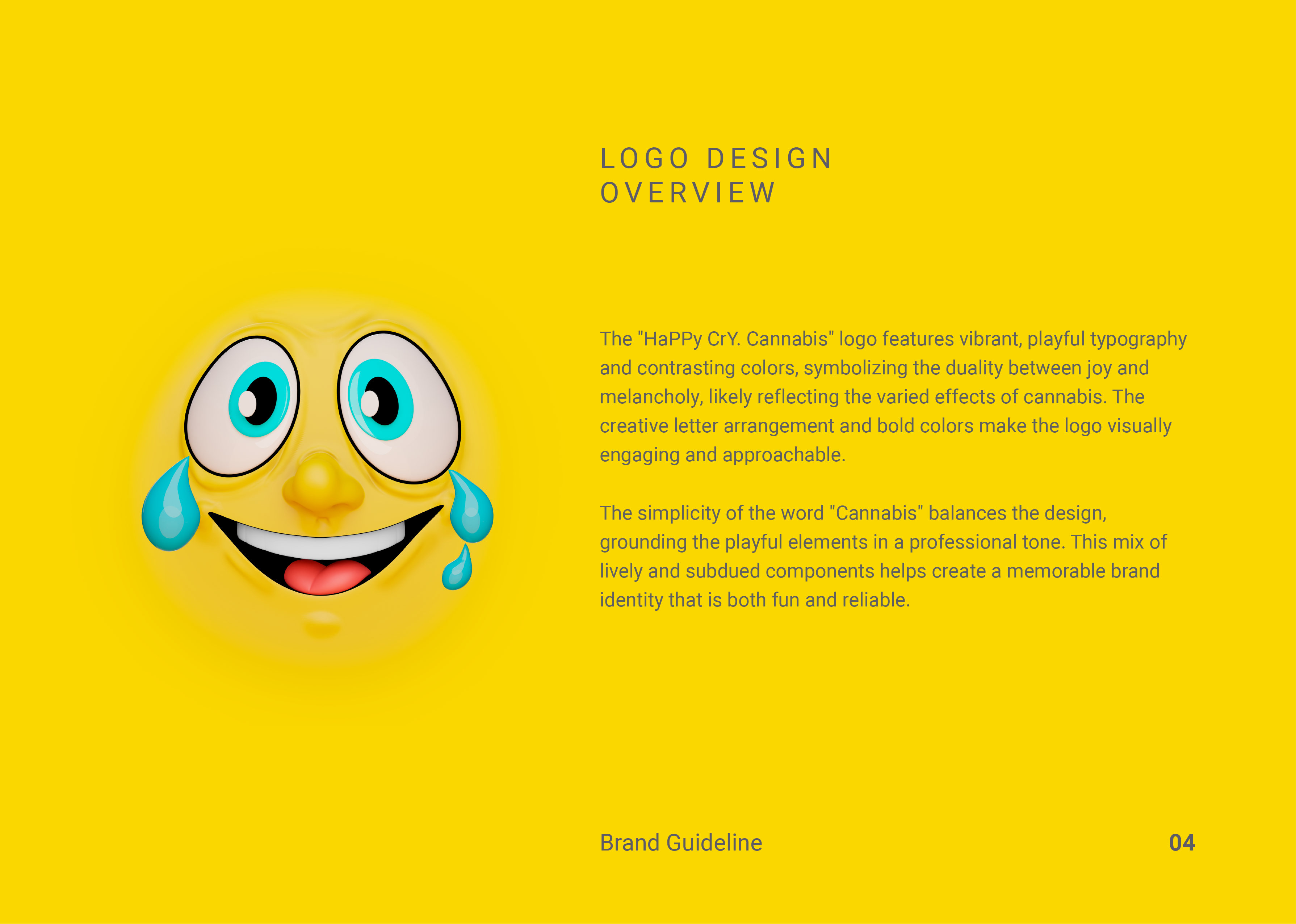
The playful design uses bold, colorful typography with a mix of joyful and melancholy motifs, emphasizing the emotional range of the brand. A cheerful typeface paired with dynamic shapes keeps the brand visually captivating and approachable. The subtle integration of cannabis references keeps the design playful without overwhelming the product.
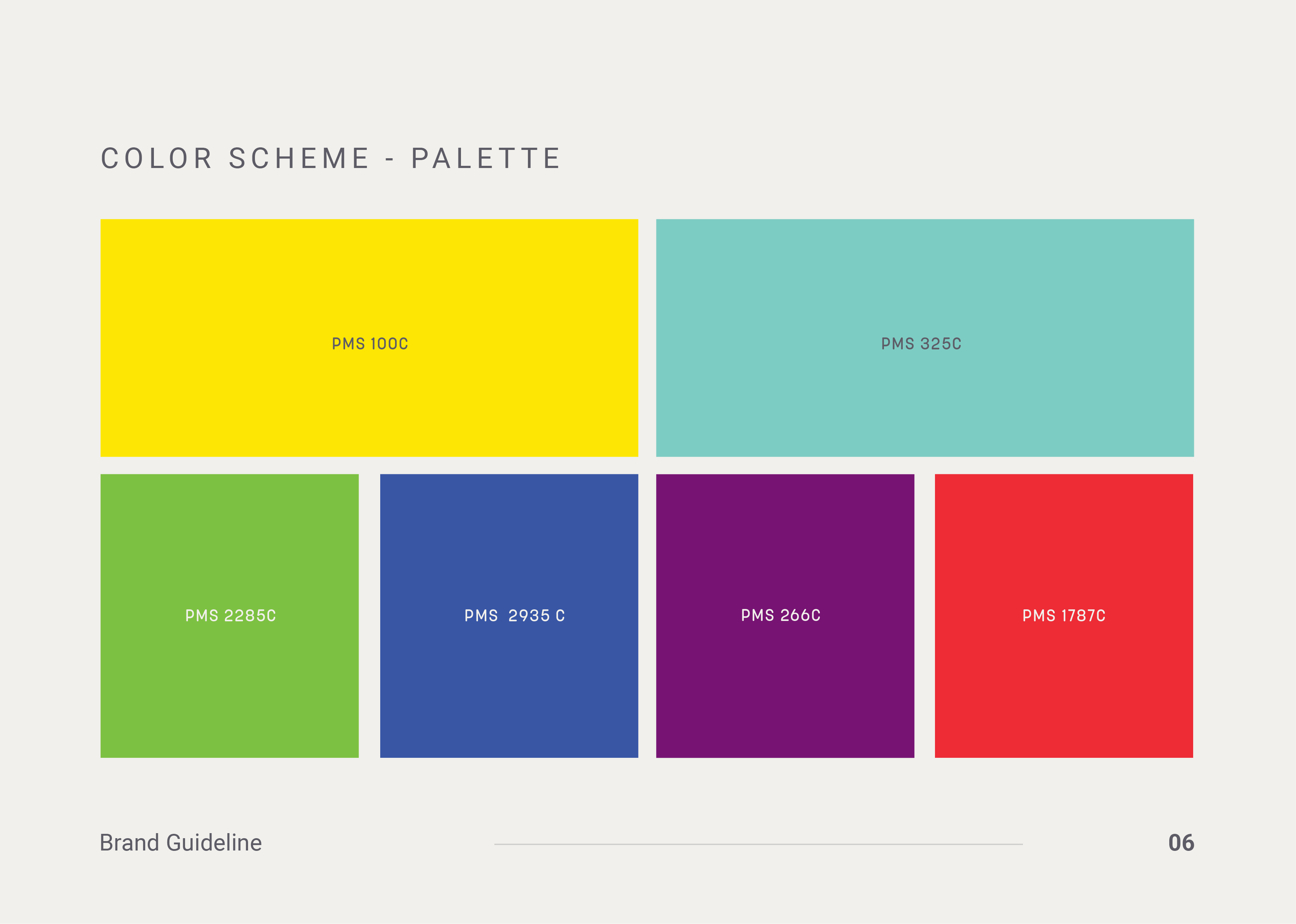
Color Palette:
A vibrant, rainbow-inspired color scheme that reflects the full emotional spectrum and reinforces the theme of happiness and reflection. Accent colors are used to add energy and vibrancy, enhancing the playful aesthetic.
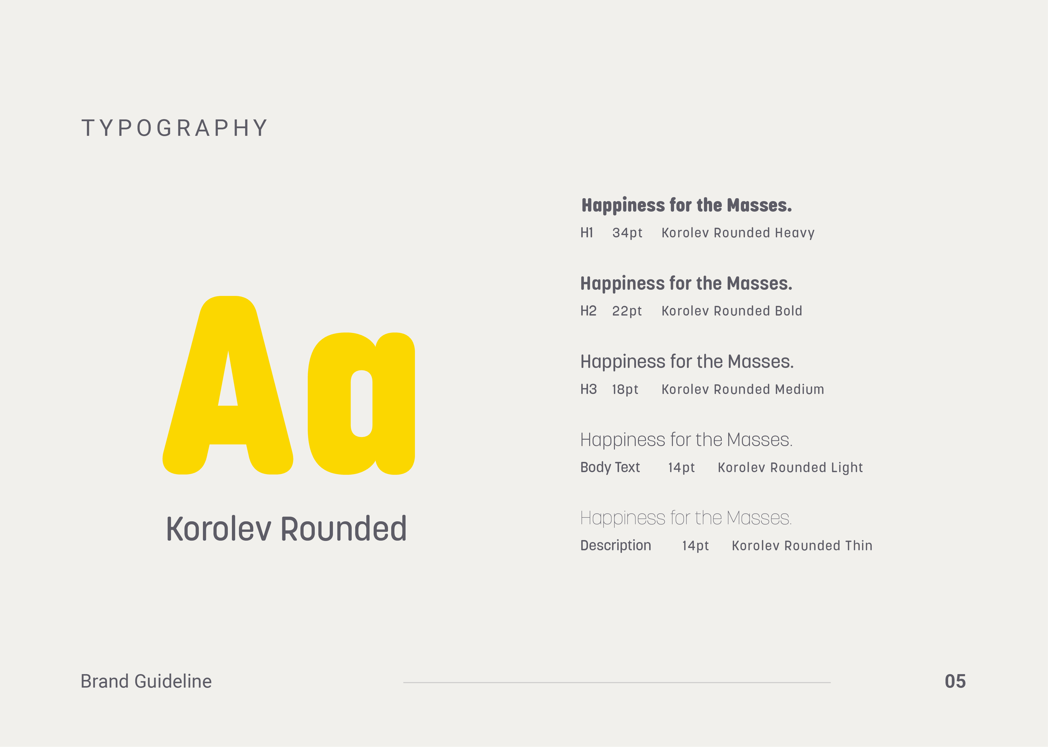
Typography:
Fun and lively fonts for headlines, with clean, legible type for body text to keep the design clear and engaging. Typography that reinforces the brand’s fun and carefree identity.
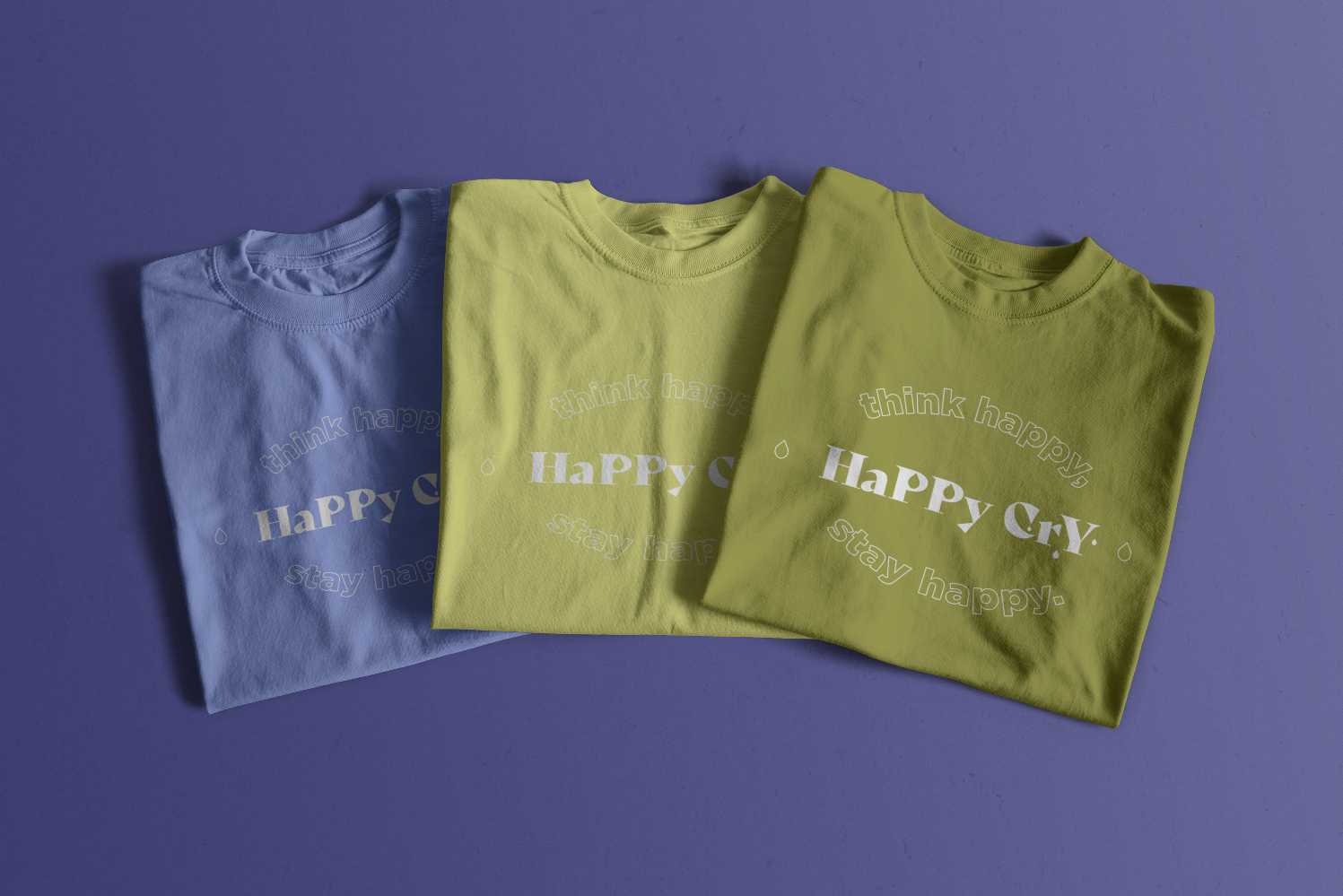
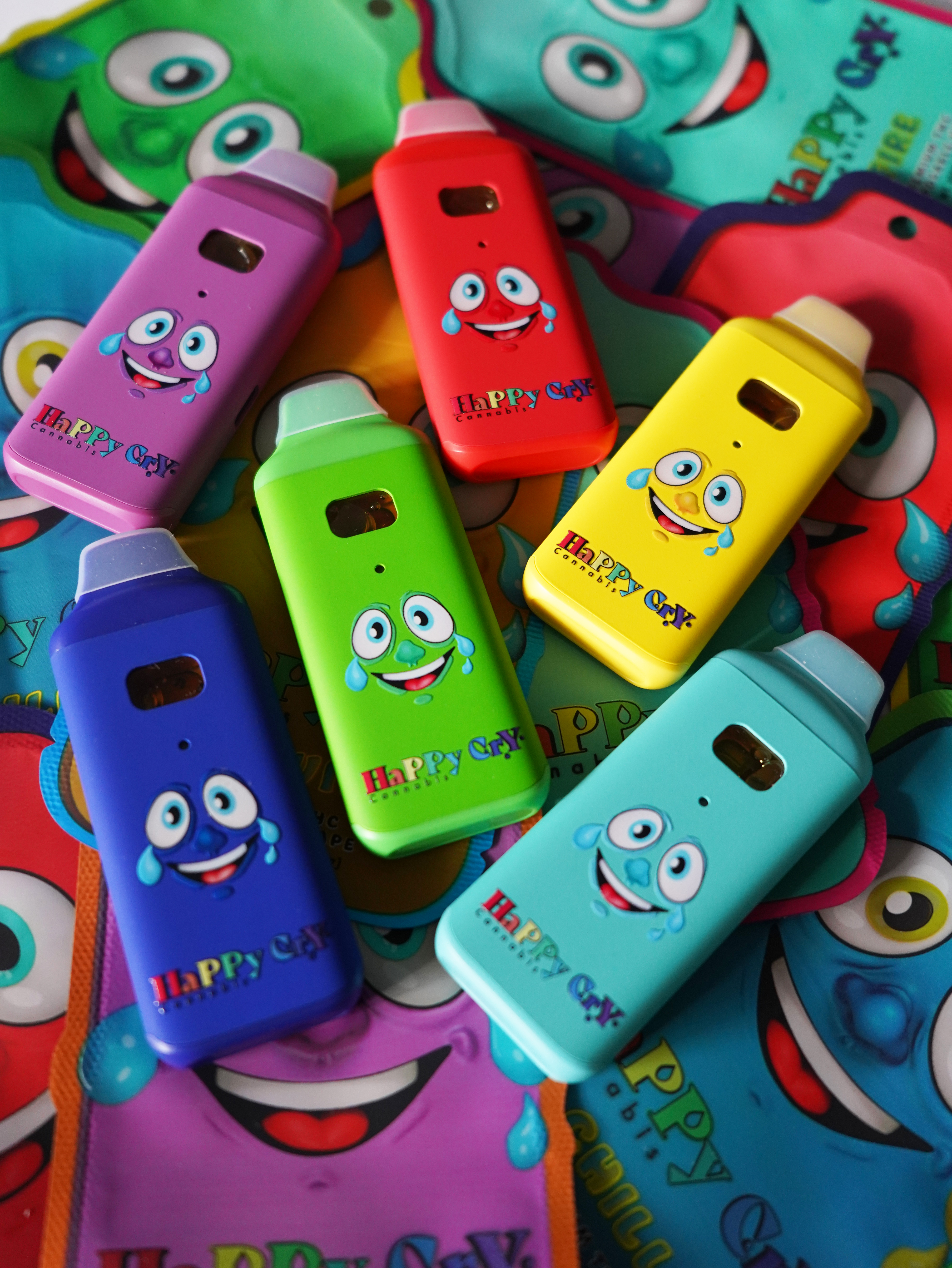
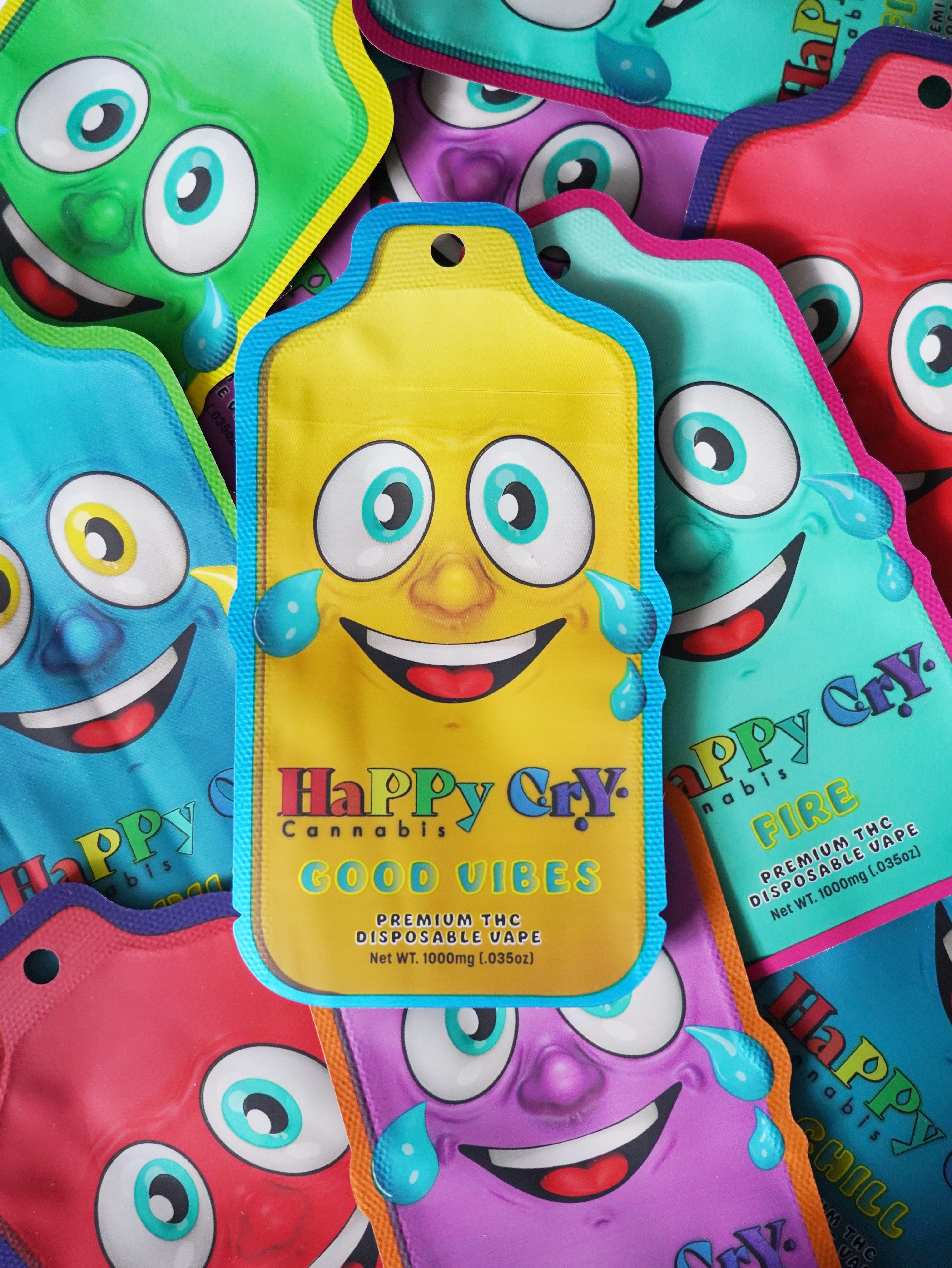
Packaging:
Bright, bold packaging that reflects the joy and emotion tied to the brand. Premium materials combined with playful designs to evoke both excitement and quality.
Visuals:
Eye-catching visuals that highlight the emotional connection customers can have with the product. Use of playful imagery that reinforces the emotional range and fun essence of the brand.
Digital Presence:
A bold, interactive website design that captures the playfulness and uniqueness of the Happy Cry brand. Vibrant social media content that emphasizes the fun and joy of Happy Cry products.
Conclusion:
The design for Happy Cry Cannabis will capture the brand’s essence by balancing joy and melancholy with a fun, approachable visual identity. By combining playful elements with authenticity, Happy Cry will resonate with consumers, creating a strong emotional connection and standing out in the cannabis market.